Rejection, Failure and The New York Times

Ever since graduation, I’d been telling myself that this moment would be the perfect opportunity to try my hand at blogging.

So many changes are happening in my life right now, it’s basically calling out for documentation and reflection (even if I fear I’ll lack the eloquence and insight of an engaging blogger.)

Of course, those life changes got in the way, and a draft of this post has been sitting on my laptop for nearly two weeks.

Hopefully I’ll get better with these deadlines.

—–

I applied to the New York Times Student Journalism Institute three times. The first two times I was rejected. This year I was finally accepted.

The first rejection was relatively easy to brush off. I was only a sophomore, I was new and green and far too untested. I’d applied with few illusions that I’d actually amount to anything. It was the New York Times. I was just learning what a lede was.

The lengthy email rejection was difficult to swallow, seemingly listing all my shortfalls and flaws. But I tried to take it in stride and tried to listen to the words of advice on how to shape myself as a young, learning journalist.

The second rejection was harder. I’d worked hard; so very hard. I thought I had a fighting chance. But yet again, a lengthy rejection letter – perhaps even the same one – was sent to my email. I still remember the moment I received it: I was sitting in a geology class, taking notes about sediment or volcanoes or some other Earth-y feature. I got the email in the middle of class and spent the rest of the time fighting tears.

The third application meant so much to me. It was simultaneously a seemingly hopeless last attempt – maybe this time they’ll like me – and a chance for me to prove to myself that I had grown into a capable journalist.

—–

As soon as the Institute started, I hit the ground running.

Immediately I tried to pursue a story, and immediately I failed.

It was a blow to the ego, but like the first application rejection, I brushed it off. I was barely given any notice and just maybe no one in Tucson was having a Mad Men watch party for the finale.

But then cam the second rejection – the second failure. Later on in the week, I’d failed to scrounge up enough sources on a story about a bridal store’s assets being seized. Then I was tasked to write a blog post about a court case and failed to be inspired to do that as well.

I felt absolutely drained of inspiration and motivation. Everyone around me was going above and beyond, producing amazing content. Yet I let three stories slip through my fingers.

But as almost always happens, things worked out. I produced five stories about everything from the weather to chickens. We published a beautiful paper. And the major crisis in the moment became a minor challenge of yesterday that will ultimately make me a better reporter.

—–

The Institute was challenging. It was a learning experience. It was the most exhausting two weeks of my life. But it was also one of the best weeks of my life. It was a place where I met some incredible people who I’m proud to call my journalism colleagues and even prouder to call my family.

It was a place where I experienced some lows in my journalism career, but also one where I experienced some highs.

I learned a lot of things that week and through out my entire time trying to get into the Institute: I learned to persevere. I learned that I will fail. But I learned that you have to pick yourself up and continue on, otherwise you’ll learn nothing from the failures and the rejections if you don’t keep trying.

11393575_10206255059440696_5720364478865180804_o
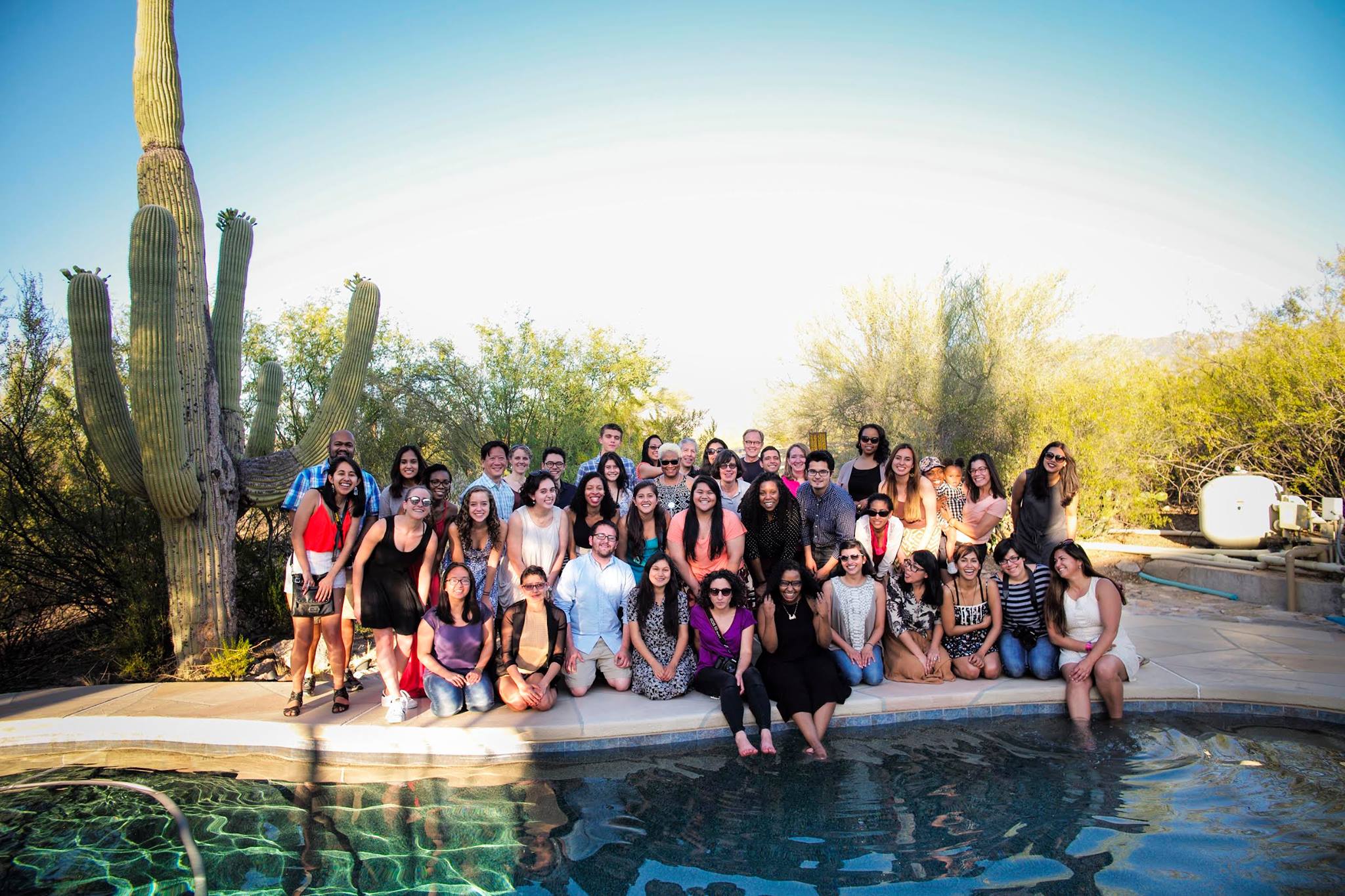
Photo by Ángel Franco

The Star Tribune’s 13 Seconds in August: covering a bridge’s collapse

This past week in Ethics class, one of the multimedia pieces we discussed stood out to me. The Star Tribune’s coverage of a bridge collapsing was evocative and impressive in it’s scope.

Check it out here: 13 seconds in August.

This piece goes way beyond other multimedia projects I’ve seen.

I loved the intro on the website. I thought the sequence of pictures and the natural sounds bites were very affective in capturing the audience’s attention.

I really liked the visual organization of each separate story; how they used an high angle shot of the collapsed bridge and matched the people up to their locations when the bridge collapsed.

There are clickable little buttons that display additional reporting, some done years after the bridge collapsed. Some buttons have simple little notes about who was there. Some have short written articles. Others have video interviews of the people who survived.

But what I think makes this piece even more unique is the “living document” aspect of it. It’s been over 5 years since the bridge collapsed but this project is still being updated with new interviews and facts. I think the journalistic dedication, organization, and foresight for this project is impressive.

Life with a prosthetic arm

Principles of Multimedia Blog Post 4

A Future Reset is a New York Times video about Cpl. Sebastian Gallegos who lost his arm while in Afghanistan.

I thought the opening segment of the video was great. It captured my attention immediately and made me want to watch the rest of the video to learn about Gallegos’s experience.

For me it also illustrated why my professor advises to begin up a video up an interview with b-roll. In this instance though the b-roll didn’t really match up with what was being said, it was dramatic and flowed well with the piece.

The one thing I didn’t like about this was the three or four still photographs that were inserted throughout the video. I felt like while they were very compositionally well put together, the pictures just seemed like too much of an abrupt break from the movement of the other video clips.

I also liked that Todd Heisler, the photographer and videographer ventured outside of Gallegos’s house and accompanied him as he went kayaking. I thought the added variety of the subject matter added more depth to the piece.

The accompanying article written by James Dao also has a beginning that I enjoyed, a dramatic opening describing how Gallegos realized he was missing an arm.

Ambitious web design for feature articles

Principles of Multimedia Blog Post 3

The internet has forever changed how journalists publish quick and to-the-point updates. In such a fast-paced society where time is limited and news organizations are battling to get the story first, Twitter has become an essential journalism tool.

But changes in long form blogging are happening as well.

An article written by Kevin Nguyen from the Nieman Journalism Lab published earlier this month brought to my attention an interesting new approach to web design.

Sites like The Verge and Pitchfork are creating beautiful layouts to showcase their stories in an aesthetically pleasing and uniquely ambitious way.

Pictures and illustrations appear and move across the screen as you scroll down the page. It feels similar to looking at a magazine article but more interactive. It doesn’t feel as if you’re reading an article. As Nguyen describes, it does feel like you’re experiencing it.

The Verge’s homepage itself is eye catching with colors utilized in a way that I have yet to see on any major news site.

One particular piece I enjoyed from The Verge was their cover story feature ‘Glitter on the Dark” about Bat for Lashes’ Natasha Khan. The photos change as you scroll and simulate movement. I feel like this creative technique presents Khan more effectively than a simple still image can.

Another interesting pieces to check out include: The Long, Strange Trip of Dock Ellis by ESPN about a baseball player who pitched an incredible game while on LSD.

Though the sites are new, it feels like they’re at the forefront of a substantial change in the way journalists present their longer pieces of work online. Journalism has already evolved into more than simply black words on a white page. Now it’s time to evolve into more than simply black words on a white screen.

Journalism on Tumblr

Principles of Multimedia Blog Post 2

I’ve reached that point in the semester where time and motivation are winding down but deadlines and assignments are becoming even more relentless. There are only a few more weeks separating me from the blissful unscheduled days of winter break yet these last few weeks may prove to be my downfall. I’ve been hitting constant roadblocks of unreturned calls and last minute interview cancelations for the last two big journalism assignments I have and I’m starting to lose hope in pulling everything off on time.

I’ve been trying to avoid the distractions of social media sites but as a journalism student it’s nearly impossible. I’m literally required to tweet for class. So while twitter has become a new form of procrastination for me, tumblr still remains my go to website for wasting time.

But amid hipster photographs of flowers and cute gifs of cats are news posts.

Though tumblr may not be as convenient as twitter is for fast minute to minute news updates it has it’s own advantages.

Tumblr is designed to display pictures so it has more capabilities in that sense and can allow for longer photo explanations and captions.

However, it’s very easy to manipulate posts on tumblr. Reblogging a post gives a lot of freedom for editing content and reposting can make it difficult to trace the source of information.

One of the best news tumblrs I follow are the Reuters blogs. Reuters has three different tumblrs; one on general news, one focused on politics, and one for pictures.

The blogs are fairly new; photography and politics began in October and April, respectively. This perhaps is the biggest challenge of news organizations on tumblr. Many are new and breaking into the tumblr community to gather a following may be difficult when the majority of people are on the website with the expectation to look at pictures of their favorite actors or find funny memes.

However, I think that if news organizations embrace tumblr the way they’ve embraced twitter, it could once again change the way we practice journalism especially in the areas of multimedia and photography.

Franz Strasser and St. Louis’s dividing line

Principles of Multimedia Blog Post 1

While working on my audit project for Ethics class tonight, I stumbled upon an interesting journalist. Franz Strasser is a reporter and videojournalist with BBC News. His work has been nominated for Emmys.

Based out of Washington, D.C. he spends a lot of his time traveling across the United States and reporting on stories he encounters.

The one that I liked in particular is called ‘Crossing a St. Louis line that divides communities.’

The element that stood out for me in this video was his use of graphics and text to help tell the story of how this street symbolizes a distinct racial and economic separation for that community.

I thought the graphics displaying the differences in median home value and median household income across Delmar were very effective in illustrating the economic differences between the neighborhoods with straight facts. I also liked the moment where Strasser took some straight on footage of Delmar, drew a line down the screen and showed the statistics for how many people on either side of the street had bachelors degrees.

There were some instances, however, where for a few seconds the side by side videos weren’t cohesive together and the transitions were a little awkward. It did work in some parts with images matching up to illustrate what a person was talking about but I think it might’ve flowed more smoothly if he’d simply cut to the B roll footage while the audio of the interview played in the background.